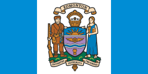
If you’re not familiar with Edmonton’s current flag, don’t worry – most people aren’t.
Here’s what it looks like:
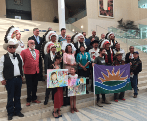
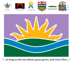
At Council today I put forward a motion asking city staff to collect public input on our current flag, as well as specifically collect feedback on Ryan McCourt’s flag design, presented by the Confederacy of Treaty 6 First Nations at Treaty recognition Day at City Hall. Here’s Ryan’s flag design:
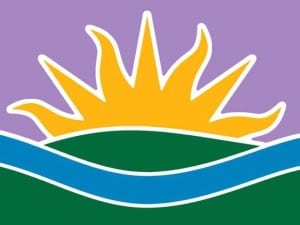
Ryan’s flag was part of an art contest adjudicated by First Nations leaders on the theme of Treaty 6 day, a design that is drawn from the text of the treaty, which reminds Settlers and First Nations beneficiaries that the Treaty is not time-limited, but enduring “as long as the sun shines, as long as the grass grows, and as long as the river flows.”
Though I love the symbolism of our current flag, its design has been often critiqued. When we turned a crest into a flag, we sacrificed readability and simplicity. There was an excellent TED talk about flag design from a few years ago that uncorked a continuing discussion in Edmonton about updating this important symbol of our city. In this talk, Mr. Mars suggests there are five basic symbols of good flag design:
- Keep it Simple.
- Use Meaningful Symbolism.
- Use Two or Three Basic Colours.
- No Lettering or Seals/Coats of Arms.
- Be Distinctive.
It’s fair to say our current flag design doesn’t exactly check many of these boxes.
It’s important to note that I am not suggesting that we change the city’s crest, which is rich in meaning and symbolism. In fact, it’s one of my favourite features when I’m touring guests around City Hall.
But the flag serves a different purpose in the life of a city.
My motion is meant to get the conversation going about what’s right for our city, and I’m not presuming the outcome. I’d like to hear from people on their views on the current flag and their views on Mr. McCourt’s flag. His design represents an important kind of symbolism: Reconciliation with First Nations, Metis and Inuit Canadians. Edmonton is leading a national conversation about reconciliation, and reassessing the symbols we use to represent ourselves is part of that journey.
For background, I asked Ryan to share some insights into his concept, starting with the purple sky:
“1. Generally, the colour purple traditionally symbolizes courage and authority.
- A purple sky (along with a rising sun) represents the dazzling auroral light that signals a new day dawning, symbolizing positive beginnings and bright futures.
- The purple colour (along with the whole colour scheme of the flag) is carried over directly from Edmonton’s current flag, as seen in the mostly-purple escutcheon (shield) of the City of Edmonton coat of arms. This shared colour scheme serves as an element of clear continuity between the current flag and the proposed new design.
- The flag design also shares the traditional colour palette of Edmonton’s official City Tartan, which specifically includes purple as one of Edmonton’s official colours.
It’s important to to be respectful of the continuity of distinctive traditional elements and colours when attempting to redesign heritage symbols like a civic flag, so I’ve taken my cues from the existing official symbolism entirely.”
Ryan’s design observes the design principles Mr. Mars outlined in his TED Talk, and its symbolism is important. But I think it’s time we talked about our flag, and I’m interested to know what you think.
The post A New Flag for Edmonton appeared first on Don Iveson.